
Family - Implementing Grid layout

In my last post, I talked about adding a grid layout to the activity. The inspiration of this layout was to remove the trial and error method of selecting (x,y) positions of a node and to implement a more efficient method of positioning the nodes. Along with that, the distance between two generations and nodes could also be maintained in a homogeneous manner, keeping the layout similar throughout the activity.
As it also turned out, the grid layout along with knowing the width and height of the node also helped in accurately positioning the edges, the effect of which will be shown in a few before-after screenshots later in this post
Implementation
Vertically, the screen is divided into three equal parts (representing three generations), represented as:
readonly property real gen_1: 0.10
readonly property real gen_2: 0.40
readonly property real gen_3: 0.70
Here, gen_1, gen_2 and gen_3 represent 1st, 2nd and 3rd generation.
Horizontally, the area was originally divided into three parts:
readonly property real left: 0.2
readonly property real center: 0.4
readonly property real right: 0.6
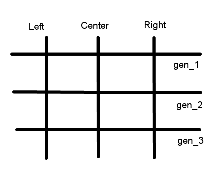
Aside from this, we also divided the horizontal area into four other slots, which will be necessary as it turned out later:
readonly property real left_ext: 0.1
readonly property real left_int: 0.3
readonly property real right_int: 0.5
readonly property real right_ext: 0.7
Here, left_int and right_int represent left and right on the interior side compared to left and right respectively. Similarly, right_ext and left_ext represent left and right exterior, compared to left and right respectively.
The nodes
The arrangement of the nodes are very simple, in which we are avoiding the problem of arranging the nodes via trial and error of the (x,y) position. The x-coordinate can be determined by selecting the best among left, right and center or among left_x or right_x (where x = 1, 2) as mentioned above and the y-coordinate can be determined via selecting the best among gen_1, gen_2 or gen_3, depending on the generation of the node.
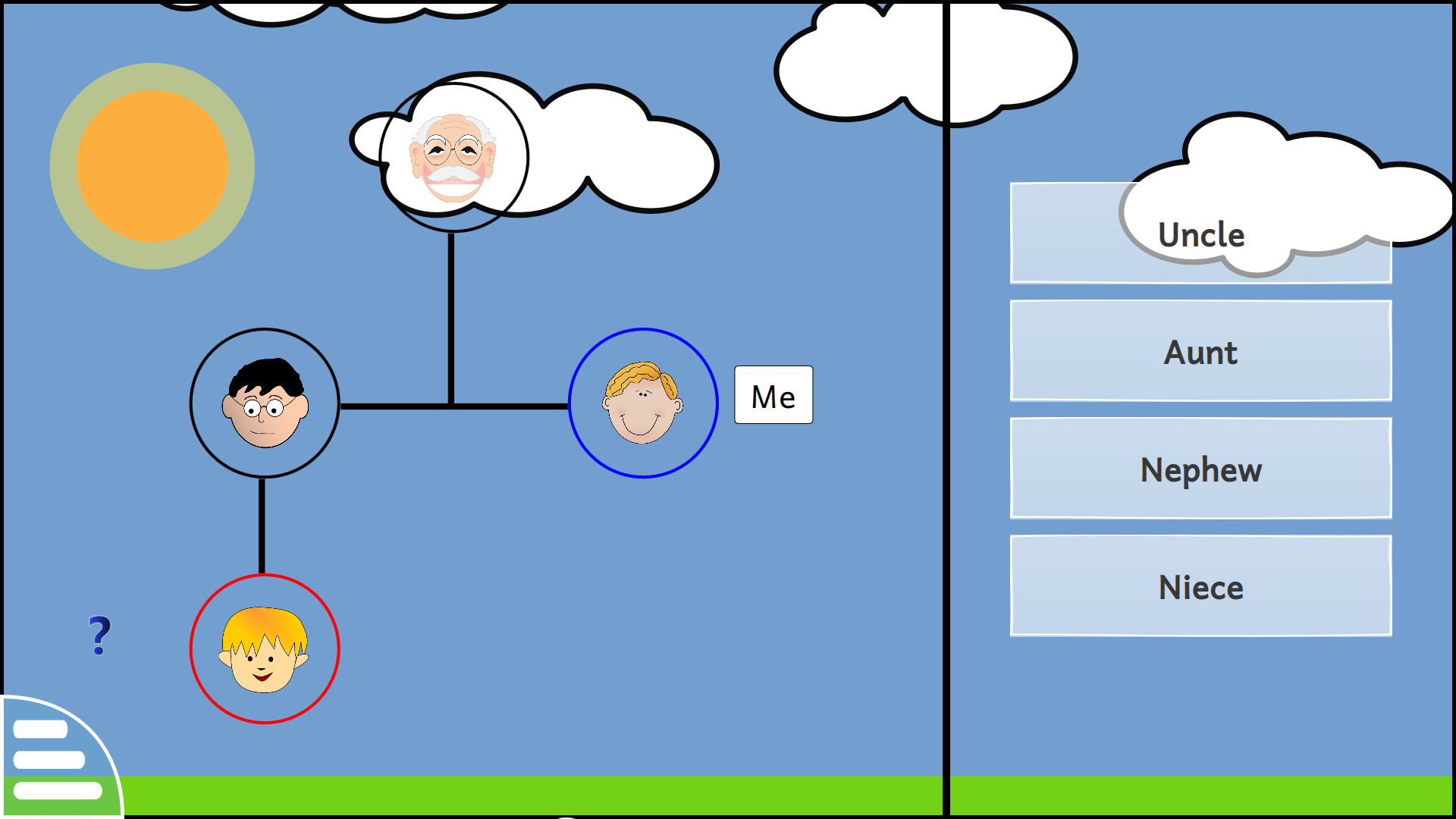
As an example, for level 11, we define the nodePositions as follow:
nodePositions: [
        [center, gen_1],
        [left, gen_2],
        [right, gen_2],
        [left, gen_3]
]
As we can see from the level, it can be seen that it is very intuitive to determine the node positions for a given level, once we know the type of the node.
The edges
The start-end position of the edges can also be determined via the properties mentioned above along with the nodeWidth and nodeHeight properties mentioned in the previous blog post. For level 11, we calculate the edge positions as:
edgeList: [
        [center + nodeWidth / 2, gen_1 + nodeHeight, center + nodeWidth / 2, gen_2 + nodeHeight / 2],
        [rightXEdge(left), nodeMidPointY(gen_2), right, nodeMidPointY(gen_2)],
        [left + nodeWidth / 2, gen_2 + nodeHeight, left + nodeWidth / 2, gen_3]
]
As a result of these, level 11 turned out to be like this:
How it all turned up
The layout has come a long way since it was started from the beginning of the second phase of GSoC, and here are the before and after screenshots of the family activity
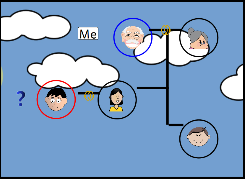 Initial layout of level 18
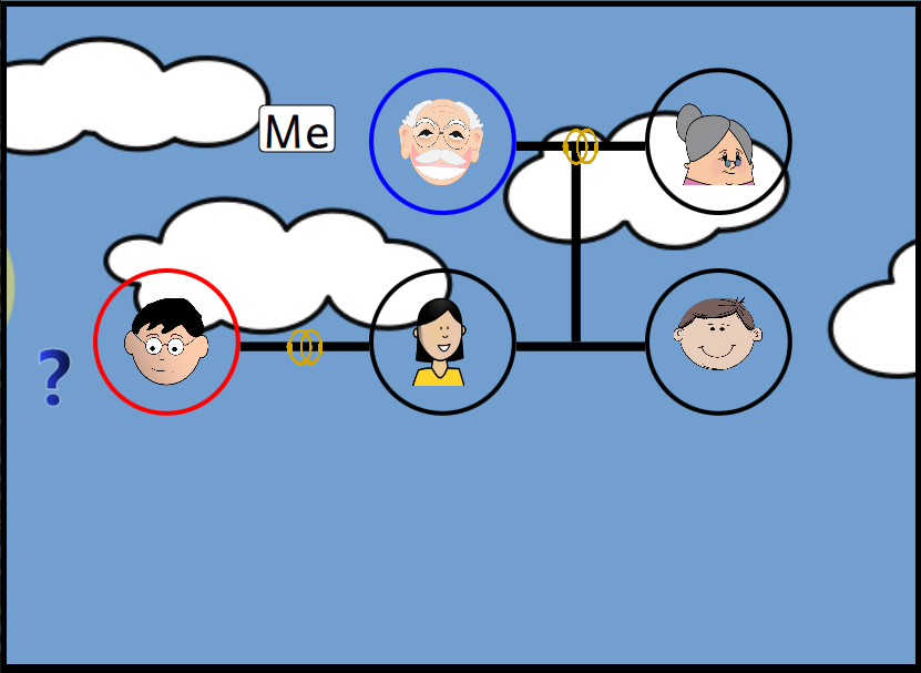 Current layout of level 18
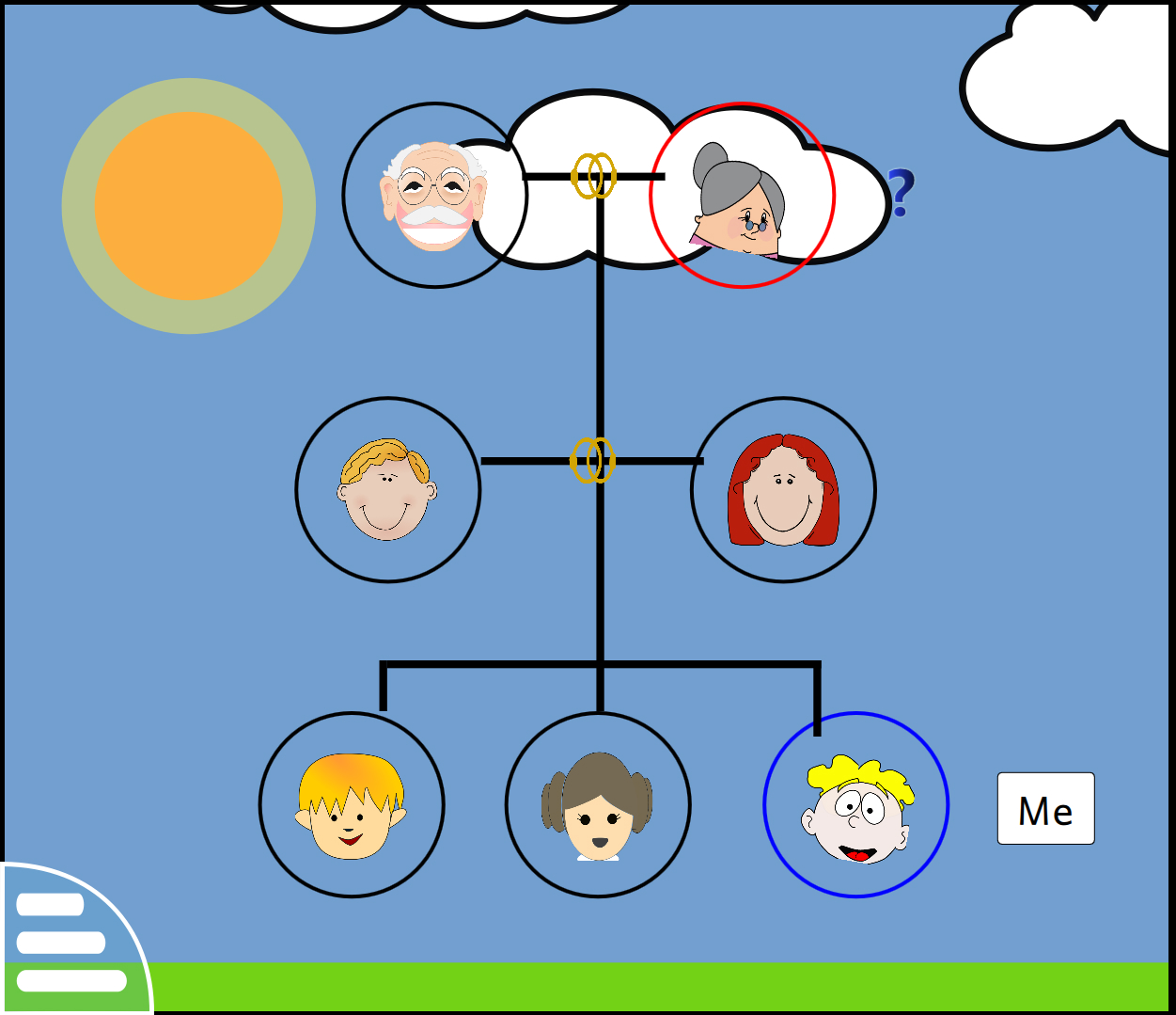 Initial layout of level 6
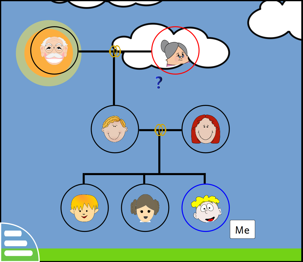 Current layout of level 6
What’s Next
I have started working on the extension of the Family activity, the goal of which is: given a relation, the user will have to find the pair that demonstrate the given relation. I will be documenting the progress of the activity once that is near completion, hopefully by the end of this week.
Relevant links
Let me know what you think of this article on twitter @RudraNilBasu or leave a comment below!